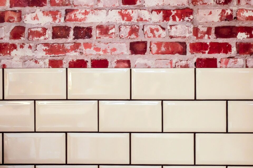
I’ve laid subway tile in three of my own homes now, and I still remember the moment it clicked for me: subway tile isn’t really “one look.” It’s a shape a simple 3×6 rectangle, give or take and the pattern you lay it in changes the entire personality of a room. The same $3-a-square-foot ceramic tile can read as a 1920s diner or a Milan design studio, purely based on how the installer arranges it.
That’s the thing most articles on this topic skip. They show you pretty pictures but never explain why a pattern works in one space and falls flat in another, or what it actually costs you in labor and wasted material. I’ve pulled together 25 patterns below, based on jobs I’ve either tiled myself, watched a tiler execute, or researched deeply enough to give you an honest verdict not just a mood board.
Table of Contents
- Why Pattern Choice Matters More Than Tile Choice
- Classic and Traditional Patterns (1–6)
- Diagonal and Angular Patterns (7–11)
- Vertical and Modern Patterns (12–16)
- Woven and Dimensional Patterns (17–20)
- Bold, Colorful, and Experimental Patterns (21–25)
- Pattern Comparison Table: Cost, Difficulty, Waste
- Where Trends Are Heading in 2026 and Beyond
- FAQs
- Final Thoughts
Why Pattern Choice Matters More Than Tile Choice
Here’s something a tile showroom won’t tell you upfront: the pattern dictates your material waste, your labor bill, and how forgiving the install is of an out-of-square wall. A basic offset pattern might waste 8–10% of tile. A herringbone or chevron pattern can waste 20–25%, sometimes more, because of all the angled cuts at the edges of the wall.
I learned this the hard way on a bathroom remodel where I fell in love with a herringbone photo online, ordered tile based on square footage alone, and ran short by half a box because nobody warned me about cut waste. Order 20% extra for anything with angles. That single sentence will save you a second trip to the tile store and a color-lot mismatch.
Grout line width and grout color matter just as much as the pattern itself. A tight 1/16″ grout line in a matching color makes a wall look like one continuous surface — great for a small bathroom where you want visual calm. A wider 1/8″–3/16″ line in a contrasting color turns the same tile into a graphic, almost architectural feature. Same tile, same pattern, completely different mood.
Classic and Traditional Patterns (1–6)
1. Running Bond (1/3 Offset) The Original Subway Look
This is the pattern from the 1904 New York subway stations that gave the tile its name. Each row shifts one-third of a tile length from the row below. It’s the safest, most classic choice, and it hides minor wall imperfections better than almost any other layout because the eye doesn’t track a straight vertical line across rows.
Best for: Traditional kitchens, rental flips, anyone who wants a timeless look that won’t date.
2. Running Bond (1/2 Offset)
The more common modern version — each tile centers over the seam of the tile below, like brickwork. It’s slightly more symmetrical-looking than the 1/3 offset and is what most big-box stores default to when they show “subway tile installed.”
Honest verdict: I actually prefer 1/3 offset over 1/2 offset for anything longer than 12 inches tall, since 1/2 offset can start to look slightly clinical in a large backsplash. For a small accent strip, 1/2 offset is fine and arguably cleaner.
3. Straight Stack (Grid Pattern)
Tiles line up directly on top of each other, grout lines forming a perfect grid. This is the pattern most likely to expose an out-of-level wall or slightly warped tile, because there’s no offset to visually distract from misalignment.
Real-world note: I only recommend straight stack with rectified tile (tile that’s been precision-cut on all edges after firing). Non-rectified tile in a straight stack pattern will show inconsistent grout lines that look like a mistake rather than a design choice.
4. Standard Herringbone
Tiles laid at 90-degree angles to each other in a V-shaped zigzag. This is probably the single most requested “upgrade” pattern I hear from clients wanting to elevate a kitchen backsplash.
5. Vertical Herringbone
Same zigzag, rotated so the “flow” of the pattern runs up the wall instead of across it. This makes a shower or backsplash feel taller, which is a genuinely useful trick in a room with low ceilings.
6. Double Herringbone
Two tiles are paired together at each step instead of one, creating a bolder, chunkier zigzag. It reads more contemporary and works well with larger-format subway tile (4×12 or bigger) where a standard herringbone would look too busy.
Diagonal and Angular Patterns (7–11)
7. Chevron
Don’t confuse this with herringbone — chevron tiles are pre-cut at an angle so the point forms a continuous, seamless “V” with no offset step. It requires specialty angle-cut tile, which costs more and has a longer lead time, but the payoff is a genuinely striking, almost fabric-like effect.
8. Diagonal Stack (45-Degree Grid)
The straight stack grid rotated 45 degrees. It makes a small bathroom feel larger because the diagonal lines pull the eye toward the corners of the room. The tradeoff is cut waste at every wall edge — expect to order closer to 25% extra.
9. Windmill / Pinwheel
A more advanced pattern where tiles rotate around a central point, often paired with a small square accent tile in the middle. This is a labor-intensive layout mostly seen in floor applications rather than walls, but it’s stunning as an entryway or laundry room floor feature.
10. Soldier Course Border
Not a full-field pattern but a finishing technique: a row of tiles laid vertically (like soldiers standing at attention) to cap off a backsplash or frame a niche. I use this constantly to give a plain running-bond backsplash a “finished” architectural edge, especially at counter height or ceiling line.
11. Diamond Accent Border
A single row of tiles rotated 45 degrees to form diamonds, typically used as a decorative band within a larger straight or offset field. Great for adding visual interest to a large, plain wall without going full diagonal everywhere.
Vertical and Modern Patterns (12–16)
12. Vertical Stack (Straight, Rotated)
Simple straight stack, but with the tile itself turned 90 degrees so the long edge runs vertically. This has become the “quiet luxury” bathroom look over the last few years — I’ve installed this in more high-end primary bathrooms than any other pattern in the last two years.
13. Vertical Offset
Vertical orientation with a running bond offset instead of a straight stack. Slightly more forgiving on wall imperfections than pattern #12, while keeping that tall, elongated feel.
14. Stretcher Bond, Wide Format
This is technically running bond, but using large-format subway tile — think 4×16 or 6×24 — rather than the traditional 3×6. Fewer grout lines mean a cleaner, more minimal look, and it’s currently one of the fastest-growing categories at tile suppliers because it installs faster (fewer pieces per square foot) even though each tile costs more.
15. Skinny Subway (Mini Subway Mosaic)
Small-format 1×2 or 2×4 tiles set on mesh sheets, usually in running bond. This scale change makes subway tile feel almost like a mosaic and works beautifully as a shower niche liner or a powder room feature wall where you want texture without overwhelming a small space.
16. Oversized Subway (Beveled Large Format)
Extra-large subway tile (sometimes 8×16 or bigger) with a beveled edge, laid in a simple offset. Fewer, bigger tiles create a bold, almost slab-like wall — this is where subway tile starts to blur into “large format tile” territory while keeping the rectangular subway proportions.
Woven and Dimensional Patterns (17–20)
17. Basket Weave
Pairs of tiles alternate direction — one pair horizontal, the next vertical — to mimic a woven basket texture. It’s a genuinely eye-catching floor or shower-niche pattern, but I’ll be honest: it’s fussy to install correctly because the pairs must line up perfectly or the “weave” illusion breaks down visually.
18. Beveled 3D Subway
Tile with a beveled or arched face that catches light differently depending on viewing angle, laid in a standard offset. Under kitchen under-cabinet lighting, this pattern genuinely appears to have depth and shadow lines even though the wall is flat. It’s one of my favorite “wow factor for the price” choices.
19. Fluted / Ribbed Subway
A newer category — tiles with a scalloped or fluted surface texture, still subway-shaped, laid in vertical stack. This has been showing up constantly in 2025–2026 kitchen renders and in person it photographs beautifully, though it does collect more dust and grease in a kitchen than a flat glossy tile, so I’d steer clients toward a bathroom application instead.
20. Interlocking Puzzle-Piece Subway
Some manufacturers now produce subway tile with a slight interlocking notch on the short edge, allowing an almost seamless running bond with minimal visible grout. It’s a niche, higher-cost product, but the visual payoff — a nearly grout-free wall — is real.
Bold, Colorful, and Experimental Patterns (21–25)
21. Color-Blocked Subway
Two or more tile colors are combined within a running bond or straight stack layout, often in a gradient (ombré) from dark to light, or in geometric blocks. This has become a signature look in commercial cafés and I’m seeing it migrate into residential kitchens now, especially in that ombré blue-to-white gradient.
22. Two-Tone Checkerboard
Alternating tile colors in a straight stack to form a checkerboard rather than a solid field. Bold, retro, and best used sparingly — a full checkerboard shower can be visually overwhelming, but a checkerboard backsplash behind a range is striking.
23. Mixed Finish (Matte + Gloss)
Same color, same size tile, but alternating matte and glossy finishes within the pattern. This is a subtle, sophisticated trick that only shows up under direct light — subway tile “hiding in plain sight” as a texture play rather than a color play.
24. Grid With Accent Stripe
A straight stack or offset field interrupted by a single contrasting-color row or column, functioning like a racing stripe through the tile field. Popular in commercial kitchens and increasingly in residential laundry rooms and mudrooms.
25. Random Ledger-Style Subway
Tiles of slightly varied width laid in loosely horizontal, non-uniform rows, similar to a ledger stone look but using rectangular subway shapes. It reads more organic and handmade — a good option for a farmhouse or Mediterranean-style kitchen where a perfectly uniform grid would feel too sterile.
Pattern Comparison Table: Cost, Difficulty, Waste
| Pattern | Install Difficulty | Typical Waste | Best Room | Visual Effect |
|---|---|---|---|---|
| Running Bond (1/3) | Easy | 8–10% | Kitchen backsplash | Classic, forgiving |
| Straight Stack | Easy–Moderate | 8–10% | Bathroom accent wall | Clean, grid-like |
| Herringbone | Moderate–Hard | 15–20% | Kitchen, shower floor | Dynamic, textured |
| Chevron | Hard | 20–25% | Feature wall | Sharp, tailored |
| Vertical Stack | Easy–Moderate | 8–10% | Primary bathroom | Tall, minimalist |
| Basket Weave | Hard | 15–20% | Shower niche, floor | Woven, tactile |
| Large Format (4×16+) | Easy | 5–8% | Modern kitchen | Sleek, minimal grout |
| Diagonal Stack | Hard | 20–25% | Small bathroom | Expansive feel |
| Color-Blocked | Moderate | 10–15% | Statement backsplash | Bold, custom |
These numbers come from a mix of my own project receipts and conversations with tile installers I trust — treat them as a planning range, not a guarantee, since wall dimensions and cut layout affect the final number.
Where Trends Are Heading in 2026 and Beyond
Having watched this category for a while, a few shifts feel durable rather than fad-driven:
Large-format subway is winning on labor cost. As tile-setter hourly rates keep climbing, fewer, bigger pieces per square foot is a real cost lever, not just an aesthetic choice. I expect 4×12 and 4×16 to keep eating into traditional 3×6 market share.
Dimensional and textured subway tile is the new “safe bold” choice. Homeowners who want drama but don’t want to commit to a loud color are reaching for fluted, arched, and beveled subway shapes instead — texture over color.
Colored grout is doing more design work than the tile itself. I’m seeing plain white subway tile paired with charcoal, terracotta, or deep green grout to completely change the mood of an otherwise neutral wall — a much lower-risk way to experiment than committing to colored tile.
Recycled and low-carbon subway tile is becoming mainstream, not niche. A handful of manufacturers now offer subway tile made from recycled glass or reclaimed ceramic content at price points close to standard ceramic — worth asking about if sustainability matters to your project.
FAQs
Is subway tile going out of style? The shape itself isn’t going anywhere — it’s proven itself over more than a century. What’s changing is the pattern and finish: plain white 3×6 running bond has cooled off a bit in favor of large-format, textured, or vertically-oriented layouts.
What pattern is easiest for a DIY first-timer? Running bond (1/3 or 1/2 offset) in a rectified large-format tile. It’s forgiving, has minimal waste, and doesn’t require the precise angle cuts that herringbone or chevron demand.
Does pattern choice affect cleaning and maintenance? Somewhat. Textured finishes (fluted, ribbed, heavily beveled) collect more grime in kitchen grease-splash zones, so I’d reserve those for bathrooms or lower-touch walls. Flat glossy tile in any pattern is the easiest to wipe down.
How much extra tile should I order for an angled pattern? Plan for 20–25% over your measured square footage for herringbone, chevron, or diagonal stack. For straight patterns, 10% is usually enough.
Can I mix two patterns in the same kitchen? Yes, and it can look intentional rather than chaotic if you keep one pattern as the “field” (like running bond across most of the backsplash) and use a second pattern (like a herringbone accent behind the range or a soldier course border) as a deliberate focal point.
Final Thoughts
If there’s one thing I’d want someone to take away from this, it’s that subway tile is one of the few materials in a renovation where the layout decision costs you nothing extra in materials but changes the entire feel of the room. You can buy the exact same box of tile for a builder-grade flip or a genuinely elevated custom kitchen — the difference lives entirely in how it’s arranged on the wall. That’s a rare kind of leverage in a renovation budget, and it’s worth spending real time on the pattern decision before a single tile goes up.
My honest advice after doing this more times than I can count: pick your pattern based on the room’s proportions and how the wall will be lit, not just on what’s trending in photos. A dramatic chevron under harsh overhead lighting can look flat, while the same pattern under a warm sconce or pendant can look genuinely custom. Walk your space at the time of day you’ll actually use it, and let that guide the final call.
About the Author
Author bio: This article was researched and written by a residential materials and renovation researcher who has spent over a decade documenting tile installation methods, material costs, and design trends across kitchen and bathroom remodels in both DIY and professionally-contracted projects. Their work focuses on translating hands-on renovation experience and installer-level knowledge into practical, jargon-free guidance for homeowners planning their own projects. They draw on direct project experience, ongoing conversations with licensed tile setters, and material-cost tracking across multiple regional markets to keep recommendations grounded in real-world outcomes rather than showroom marketing.