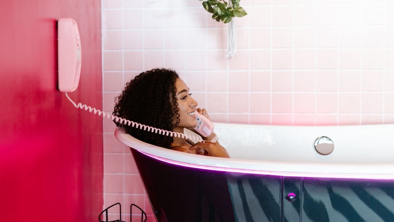

I’ve spent years helping clients update bathrooms, and few decisions spark as much hesitation—and eventual delight—as pink tiles. People still associate the color with those glossy 1950s powder rooms, complete with matching sinks and a faint Pepto-Bismol vibe. Yet the pink tiles I specify today feel completely different. Soft blush, dusty rose, terracotta-tinged, and muted mauve versions now read as warm neutrals that soften a space without tipping into kitsch. When the lighting, layout, and pairings are right, a pink-tiled bathroom can feel calm, expensive, and surprisingly timeless.
This guide walks through everything I’ve learned from real projects: how to pick the shade that works with your light, which materials hold up in wet zones, the layouts that elevate rather than date the room, honest cost and maintenance realities, and the pairings that keep pink looking current. No recycled trend lists—just practical notes from the field.
Table of Contents
- Why Pink Bathroom Tiles Are Worth Considering Right Now
- Understanding Pink Shades: From Barely-There Blush to Deeper Rose
- Material Showdown: Ceramic, Porcelain, Zellige, Glass, and Stone
- Style and Layout Options That Actually Work
- Pairing Pink Tiles with Fixtures, Grout, and Surfaces
- Real-World Cost Breakdown and Installation Notes
- Maintenance Realities and Common Pitfalls
- Future Trends I’m Watching
- Frequently Asked Questions
- Final Thoughts
- About the Author
Why Pink Bathroom Tiles Are Worth Considering Right Now
Bathrooms have spent years in a cool-white-and-gray loop. The shift toward warmer palettes makes sense: pink softens hard edges, flatters skin under morning light, and creates a gentle glow that pure white rarely achieves. Designers I talk to treat soft pinks the way they once treated beige—as a flexible base rather than a statement color.
The modern versions lean matte or lightly glazed, with subtle variation instead of uniform candy-shop gloss. I’ve seen clients who swore they “hated pink” fall for a dusty rose zellige shower surround once it was installed next to white oak and unlacquered brass. The color stops reading as “feminine” or “retro” and starts reading as “warm and intentional.”
North-facing rooms benefit especially; cooler natural light can make pure white feel sterile, while a warm blush counters that chill. South-facing spaces handle cooler, slightly gray-tinged pinks without going flat. The key is testing samples under both daylight and your actual evening bulbs (2700K is almost always kinder to pink than cooler LEDs).
Understanding Pink Shades: From Barely-There Blush to Deeper Rose
Not every pink behaves the same. I sort them into practical groups based on how they perform in bathrooms:
- Barely-there blush / high-LRV soft pink: Almost a warm white with a hint of peach. Excellent in small or windowless baths. It reads neutral at night and soft during the day.
- Classic millennial or dusty rose: Muted, slightly grayed or earthy. The most versatile and forgiving for most homeowners. Hides water spots better than pure pastels.
- Coral / terracotta pink: Warmer, with orange or clay undertones. Feels grounded and pairs beautifully with wood and brass. Great when you want more personality without going bold.
- Mauve or berry-tinged: Cooler, with violet notes. Works in larger spaces or with strong contrast (black fixtures, deep green accents). Can feel moody if the lighting is wrong.
- Saturated or vintage-inspired rose: Closer to the mid-century look. Use sparingly—feature wall or half-height—unless you’re fully leaning into the retro vibe with modern finishes.
I always recommend ordering multiple samples and living with them for a few days. Hold them against your existing vanity, flooring, and towel colors. What looks perfect under showroom fluorescents can shift dramatically at home.
Material Showdown: Ceramic, Porcelain, Zellige, Glass, and Stone
Material choice determines longevity more than shade. Here’s the practical comparison I share with clients, based on projects from budget powder rooms to full master baths.
| Material | Water Absorption | Best Use | Durability / Maintenance | Approx. Material Cost (per sq ft) | Honest Verdict |
|---|---|---|---|---|---|
| Ceramic | Higher (glazed helps) | Walls, low-traffic accents | Good for walls; avoid floors in wet zones | $2–$10 | Budget-friendly and easy to cut; fine for walls if quality is high |
| Porcelain | Very low (<0.5%) | Floors, showers, full wet areas | Excellent; low maintenance | $4–$15+ | My default for most bathrooms—hard-wearing and consistent |
| Zellige (handmade terracotta) | Higher (needs sealing considerations) | Walls, feature areas | Beautiful variation; more care needed | $20–$40 | Worth it for texture and soul; hire an experienced installer |
| Glass mosaic | Non-porous | Accents, niches, shower walls | Easy clean but shows spots | $8–$20 | Great light reflection in small spaces; slippery if used on floors |
| Natural stone / marble-effect | Variable (stone needs sealing) | Feature walls or luxury floors | High maintenance for real stone | $15–$50+ | Stunning but only if you’re committed to sealing and careful cleaners |
Porcelain wins for most full bathrooms because it shrugs off moisture and daily wear. Ceramic works well on walls when budget is tight. Authentic zellige from Clé Tile (shades like Blushing Mistress or Vintage Rose) brings the irregular glaze and handmade character that mass-produced tiles can’t match—I’ve used their blush options in several projects and the variation keeps the surface from looking flat. Fireclay Tile’s recycled-content ceramics (including warmer pinks like Rosarita or Tumbleweed-adjacent tones) offer solid color consistency and sustainability credentials at a premium price point.
Marble-effect porcelain gives the veining without the etching risk of real stone. Real pink marble or onyx looks luxurious but demands regular sealing and pH-neutral cleaners—fine for a powder room, riskier in a daily shower.
Style and Layout Options That Actually Work
The layout often matters more than the exact shade.
Subway and elongated rectangles remain the most flexible. A matte blush subway in a classic brick pattern feels calm. Stack it vertically to make a low ceiling feel taller. Herringbone or chevron adds movement without needing a second color. I’ve done pink subway with white grout for a soft look and charcoal grout for definition—both succeed when the fixtures are clean-lined.
Hexagons and geometric mosaics lean playful or Art Deco. Soft pink hex floors with white grout create a gentle honeycomb effect. Smaller mosaics work beautifully in shower niches or as a border.
Zellige or handmade-look tiles shine in straight or staggered layouts where the natural variation can show. Avoid forcing perfect alignment; the charm is in the slight irregularity.
Large-format porcelain (24×48 or similar) reduces grout lines and makes small bathrooms feel larger. Pink marble-effect slabs in a continuous floor-to-wall application create a spa-like envelope.
Partial applications are often smarter than full-room pink. Half-height wainscot with painted walls above, a single feature wall behind the vanity, or tiling only the shower keep the color impactful without overwhelming. In one recent powder room I limited pink to the lower third plus a niche, then painted the upper walls a warm white—guests still comment on the “pretty pink bathroom” even though most of the surface isn’t tiled.
Pairing Pink Tiles with Fixtures, Grout, and Surfaces
Pink thrives with contrast and texture rather than more pink.
- Metals: Unlacquered or brushed brass and champagne bronze warm it up. Matte black gives crisp modern edge. Polished chrome can feel cooler and more clinical.
- Vanities and wood: White oak, walnut, or painted cabinetry in soft greige or warm white balance the color. Avoid orange-toned woods that clash with certain pinks.
- Countertops and floors: Honed marble, quartz with subtle veining, or concrete-look surfaces keep things grounded. If the walls are pink, a neutral floor (large-format porcelain or wood-look) usually works better than matching pink underfoot.
- Grout: White or light gray keeps the look fresh. Matching pink grout softens everything into a tonal field. Darker gray or black creates graphic definition—especially effective with subway or geometric layouts.
- Lighting and textiles: Warm bulbs (around 2700K) flatter pink. Linen or cotton towels in white, soft green, or muted teal provide breathing room. A simple plant softens the hard surfaces.
Avoid competing strong colors unless you’re deliberately going maximalist. One or two supporting tones plus the pink usually feels more resolved.
Real-World Cost Breakdown and Installation Notes
Material alone for pink tiles typically runs $3–$15 per square foot for solid ceramic or porcelain options, climbing to $20–$40+ for authentic zellige or designer glass. Installed costs for a standard bathroom (floor + walls or shower) often land in the $12–$30+ per square foot range once labor, thinset, grout, waterproofing, and waste are included. A modest powder-room feature wall might stay under $1,500–$2,500 total; a full master shower and floor can easily reach $5,000–$12,000 depending on complexity and region.
Patterns like herringbone increase labor and waste. Large-format tiles require a flatter substrate and more skill. Always buy 10–15% extra for cuts, breakage, and future repairs—especially with handmade tiles where batch variation exists.
I insist on proper waterproofing (liquid membrane or sheet systems) behind every wet-area installation. Pink tiles look beautiful until moisture finds a path behind them.
Maintenance Realities and Common Pitfalls
Most glazed ceramic and porcelain pink tiles clean with a pH-neutral bathroom cleaner and a soft cloth or microfiber. Avoid abrasive powders or acidic products that can dull the glaze over time. Glossy surfaces show water spots and soap scum more readily than matte ones—wipe them down more often or choose a lower-sheen finish if low maintenance is a priority.
Zellige and natural stone need more attention: seal as recommended and stick to gentle cleaners. Hard-water areas benefit from a squeegee after showers regardless of tile type.
Common mistakes I still see: choosing a pink that turns gray under the existing lighting, pairing high-gloss pink with busy patterned floors, using pure white grout that yellows quickly against soft pink, and installing non-rated tiles on floors. Test everything in the actual room before committing.
Future Trends I’m Watching
Pastel and dusty pinks continue to appear in 2025–2026 trend reports as part of a broader move toward softer, more human color. Handmade texture (zellige, slightly irregular surfaces) shows no sign of fading. We’re also seeing more mixed-material applications—pink tile with terrazzo accents, or pink paired with deep jewel tones for drama rather than pastels alone. Large-format continuous surfaces and vertical orientations remain strong for making modest bathrooms feel intentional.
I expect the “pink as neutral” approach to stick longer than pure trend colors because it solves a real problem: bathrooms that feel cold or clinical.
Frequently Asked Questions
Will pink bathroom tiles go out of style quickly?
Soft, muted versions are being used as warm neutrals. They’re less trend-dependent than saturated brights. Proper installation and classic layouts help them age gracefully.
Are pink tiles harder to keep clean?
Not inherently. Matte and mid-tone options hide spots better than pure white or high-gloss pastels. Regular wiping is the real difference-maker.
Can I use pink tiles on the floor?
Yes—with the right material. Porcelain with adequate slip resistance (check the COF rating) works well. Avoid glossy glass or soft ceramics underfoot in wet zones.
How do I make a small bathroom with pink tiles feel bigger?
Choose lighter blushes, larger formats with fewer grout lines, vertical layouts, reflective or glossy accents, and plenty of warm light. Keep the rest of the palette simple.
Is DIY installation realistic?
For simple wall applications with standard subway, experienced DIYers can manage. Showers, floors, large formats, and handmade tiles benefit from a skilled tiler—especially for waterproofing.
Final Thoughts
Pink bathroom tiles succeed when they’re chosen with the same care you’d give any other long-term surface decision. The right shade softens the room. The right material stands up to daily use. It right layout and pairings keep it from feeling dated. I’ve watched skeptical clients step into finished spaces and immediately relax—the color does something white rarely does.
Start with samples in your actual light. Decide whether you want a full commitment or a strategic accent. Prioritize performance in wet zones. Then enjoy the quiet warmth that a well-executed pink bathroom brings. It stops being “the pink bathroom” and simply becomes a good bathroom that happens to feel welcoming every time you walk in.
About the Author
Elena Vargas is an independent interior researcher and bathroom design consultant based in the Pacific Northwest. With more than a decade of hands-on experience specifying materials for residential renovations, she focuses on practical performance, long-term livability, and honest material comparisons. Her work draws from site visits, client feedback, and ongoing testing of finishes under real bathroom conditions rather than showroom lighting alone.
[…] Chair: What It Is, Styles, Materials, and How to Choose One Pink Bathroom Tiles: A Complete Guide to Choosing the Right Style Wicker Chaise Lounge: A Complete Guide to Style, Comfort, and Care Wood Canopy Bed: A Complete […]