Introduction
Churlish Green Paint: How to Use This Deep Green in Interiors explores a rich, moody green shade that has become a strong trend in modern interior design. Churlish Green is a deep, earthy green tone that sits between forest green and olive, offering a grounded and sophisticated look for residential and commercial spaces.
This color is widely used by designers who want to create depth, calmness, and a connection to nature indoors. Unlike bright greens, Churlish Green feels mature, balanced, and versatile, making it suitable for both bold feature walls and full-room applications.
This guide explains how to use Churlish Green paint effectively, including room-by-room ideas, color combinations, lighting effects, furniture matching, styling techniques, and expert design insights.
What Is Churlish Green Paint?
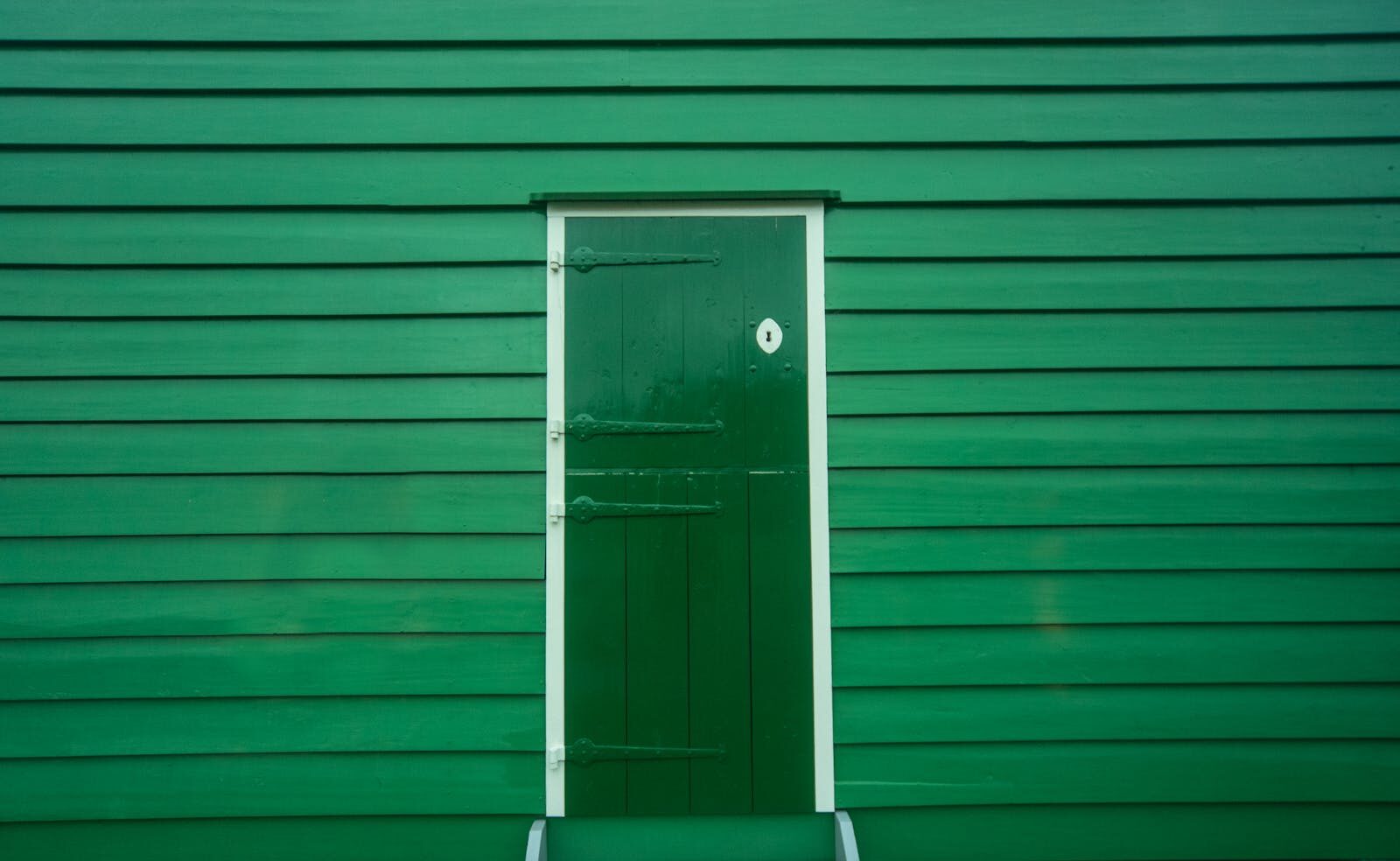
Churlish Green is a deep, muted green shade with earthy undertones. It is often described as a heritage-inspired green that brings a natural yet luxurious feel to interiors.
Key Characteristics
- Color family: Deep green
- Undertones: Earth, olive, and subtle grey
- Finish effect: Rich and velvety on walls
- Mood: Calm, grounded, and elegant
Expert Insight: Deep greens like Churlish Green work as “visual anchors” in interior spaces, helping balance bright or neutral elements.
Why Churlish Green Is Popular in Interior Design
1. Connection to Nature
It brings an organic outdoor feeling indoors.
2. Luxury Aesthetic
Deep green tones are often associated with high-end interiors.
3. Versatile Neutral Alternative
Works as a strong alternative to grey, beige, or white.
4. Works Across Styles
Fits modern, classic, rustic, and industrial interiors.
Best Rooms to Use Churlish Green Paint
1. Living Room Design
Churlish Green creates a dramatic yet calming living space.
Design Ideas
- Feature wall behind sofa
- Full-room color for cozy effect
- Combined with neutral furniture
Best Pairings
- Cream sofas
- Wooden coffee tables
- Brass or gold lighting
2. Bedroom Design
Ideal for restful and cocoon-like environments.
Styling Ideas
- Accent wall behind bed
- Full-room moody green design
Expert Tip
Use warm lighting to soften the depth of the green.
3. Kitchen Design
Adds sophistication to modern kitchens.
Applications
- Cabinet fronts
- Kitchen islands
- Lower cabinetry
4. Bathroom Design
Creates spa-like elegance.
Styling Ideas
- Green walls with marble
- Black or brass fixtures
5. Home Office
Improves focus and reduces visual fatigue.
Color Pairing Guide
Neutrals
- Warm white
- Beige
- Soft grey
Bold Contrasts
- Brass gold
- Deep navy
- Terracotta
Natural Pairings
- Oak wood
- Walnut furniture
- Rattan textures
Insider Tip: Churlish Green looks most balanced when paired with warm natural textures like wood and linen.
Lighting Effects on Churlish Green
Natural Light
- Brings out earthy undertones
- Makes the space feel fresh
Artificial Light
- Warm lighting enhances depth
- Cool lighting can make it appear darker
Lighting Strategy
Use layered lighting for balance: ambient, task, and accent lighting.
Furniture That Works Best
Upholstery
- Cream fabric sofas
- Beige armchairs
Wood Finishes
- Light oak for contrast
- Dark walnut for luxury feel
Metal Accents
- Brass for warmth
- Matte black for modern edge
Styling Approaches
Minimalist Style
- Clean lines
- Limited decor
Luxury Style
- Marble surfaces
- Statement lighting
- Metallic finishes
Natural Style
- Plants
- Wood textures
- Linen fabrics
Common Mistakes to Avoid
Overusing Dark Tones
Can make rooms feel smaller if not balanced.
Poor Lighting
Reduces vibrancy and depth.
Lack of Contrast
Makes the space look flat and dull.
Expert Design Tips
- Balance with lighter neutrals
- Add natural materials for warmth
- Use matte finishes for depth
- Include greenery for freshness
- Apply color in layers, not flat blocks
Churlish Green vs Other Dark Greens
Compared to Forest Green
- More muted and earthy
Compared to Emerald Green
- Less bright, more grounded
Compared to Olive Green
- Deeper and more dramatic
Psychological Impact
- Promotes calmness
- Enhances focus
- Creates grounding effect
- Adds emotional depth
Best Decorative Accessories
- Ceramic vases
- Linen curtains
- Brass mirrors
- Natural fiber rugs
Maintenance Tips
- Use matte or eggshell finishes
- Clean gently with soft cloth
- Avoid harsh chemical cleaners
Is Churlish Green a Good Choice?
Yes. It is a highly versatile and modern deep green shade that works in both residential and commercial interiors. Its ability to act as both a statement color and a neutral base makes it a strong design option.
Conclusion
Churlish Green Paint: How to Use This Deep Green in Interiors demonstrates how a rich, earthy green can transform spaces into elegant, calming, and sophisticated environments. With proper lighting, balanced furniture, and thoughtful color pairing, this shade can work across many interior styles.
It is a powerful design choice for those looking to add depth, personality, and a natural aesthetic to their interiors.