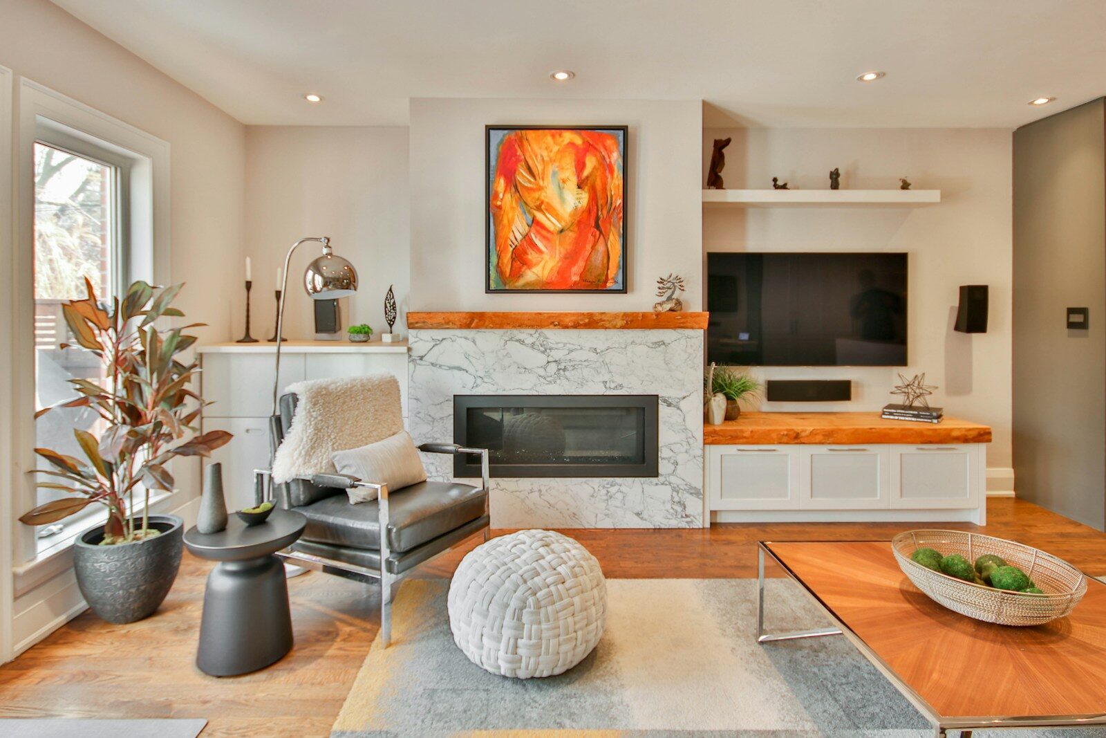
Decor a home is one of those things that sounds simple until you find yourself in the middle of a room holding a paint swatch, doubting every decision you’ve ever made. Trust me, I’ve been there. Staring at a wall that looks off but I can’t quite put my finger on why, or buying a rug that looks perfect online and is utterly lost in real life.
What I have learned, slowly and sometimes the hard way, is that good home decor is not about trends or matching everything perfectly. It’s about knowing how space, light and objects work together – and then making choices that reflect the real life you live in your home.
This guide focuses on the three rooms that most people care about the most: the living room, the bedroom, and the kitchen. Not with some generic list of tips, but with the sort of nuanced, specific advice that actually changes the feeling of a room.
Living Room Decor – Everything Has To Work Together
The living room is the most difficult room in the home, design-wise. It needs to be a gathering place, a place to relax, sometimes a home office nook and often an entry point – all at once. Most living room decorating problems are not a matter of bad taste, but are created by attempting to solve too many problems with too few conscious choices.
Begin With the Couch, Not the Accessories
The sofa is the central weight-bearing element of any living room. Everything else is secondary to that. But most people buy a sofa on colour or style and then spend years at war with it.
The more useful approach first is to choose by scale. A sofa that’s too small for the room makes all other furniture look orphaned. A sofa that is too big can dominate and constrict the space. Generally, the sofa should occupy approximately two-thirds of the wall it faces or anchors. Not a hard rule, but a good place to start.
Fabric is hugely important, and not simply for looks. Velvet is rich and warm, but it shows every pet hair and watermark. Performance linen is more forgiving, and ages better. Bouclé, the loop-pile fabric that was everywhere in design media from 2022 onwards, is still in vogue in 2026 thanks to its photogenic quality and durability. If kids or pets are in the picture, a mid-tone performance fabric will be a better bet than anything that needs careful upkeep.
The Rug Problem (And How To Fix It)
The biggest mistake we see in living rooms more than any other: The rug that’s too small. It is so pervasive it seems almost conspiratorial. A small rug floats in the middle of a room, making the space feel disjointed and temporary, like furniture that hasn’t yet decided where to land.
The fix is simple, if counterintuitive: buy a bigger rug than you think you need. In most living rooms, all the major seating pieces should have their front legs on the rug. Not the whole sofa, just the front legs. This creates visual cohesion and makes the seating feel like a defined conversation zone rather than just scattered furniture.
For a regular living room, a 9×12 rug is usually the smallest size. Better is a 10×14. Have you ever been in a room and felt like something was “off” and not known why? Look at the rug. Often it is the answer.
Lighting Layers Most Skip
Headlights are the enemy of a comfortable living room. It’s flat, shadowless, unforgiving, like fluorescent office lighting in a space made for rest and connection.
Great living rooms are layered with lighting: ambient (diffused overhead), task (reading lamps, directional fixtures), and accent (picture lights, sconces, candles). It adds depth and flexibility to the room, bright and functional during the day, warm and intimate in the evening.
The most common upgrade that most people overlook is putting overhead lights on a dimmer. It costs almost nothing, takes an hour, and changes the room for the better. The next step up is to place a floor lamp in any corner that feels dark or heavy. Corners that receive light appear larger and more inviting; corners that don’t seem to pull the room in.
A Colour Strategy That Actually Works
The biggest colour mistake in living rooms is not choosing the wrong colour it’s painting all four walls the same colour and nothing else. This creates a monolithic effect that makes rooms look smaller and less dynamic.
The more interesting approach is the 60-30-10 rule applied thoughtfully. 60% dominant colour (walls, large furniture) 30% secondary colour (rugs, accent chairs, curtains) 10% accent (cushions, art, objects). The percentages don’t have to be exact, but the principle does. Nothing is visually interesting if one colour is dominating everything.
Gray’s reign over living room colour palettes ends in 2026, ending the 2015-2022 trend. Warm terracottas, deep sage greens, dusty mauves and off-white with warm undertones have taken over. The shift is a reflection of a broader cultural desire for touch and warmth, rather than the cool, minimal aesthetic of the last decade.
decor a bedroom is about creating a bedroom space for sleep, sanctuary and self.
The bedroom is the only room in a home where the single most important function is biological. You spend about a third of your life there, doing something your brain and body desperately need. Decor choices here are not just about how your bedroom looks; they affect your sleep, your stress level, and how you feel when you wake up.
The Room is the Bed
In a bedroom, the bed isn’t only the largest piece of furniture it is the room. Everything else is relative to it. The height, the placement and the visual weight of the bed frame set the whole tone.
Most people don’t realise how important bed placement is. In most rooms, the bed is placed in the middle of the main wall and is reachable from both sides. This creates symmetry and ease of use. Pushing a bed into a corner to save space or to create a “cozy” feeling almost always makes the room more difficult to use and more difficult to decorate around.
Headboards have to be argued about. A headboard gives visual weight and completes the bed as a piece of furniture. Even a fancy bed seems incomplete without one. Tall, upholstered headboards, especially in linen, boucle or velvet are still a popular choice as they add softness to a room without needing any other decorating skills. They do the work for you.
Bedding: Most People Don’t Spend Enough
A beautiful room with mediocre bedding will always look mediocre. It is the most visible surface in the space, and the quality is immediately apparent.
Fibre and weave matter far more than thread count. Long-staple Egyptian cotton or cotton-linen blends in a percale or sateen weave will beat any high thread count polyester blend by any measure feel, breathability, durability and visual quality. They cost more initially but significantly less over the long haul.
Bedding colour: The best ageing approach is neutral bedding with textured layers (different weaves, throws and shams in tonal variations). High-contrast patterned comforters date quickly. A quiet, layered texture in warm neutrals will look just as good in five years as it does now.
The Problem with Bedroom Lighting
Most bedrooms have one overhead light and two bedside lamps. The overhead light is usually too bright, the bedside lamps are usually too dim and the end result is a room that never quite feels right at any time of day.
The fix: Treat bedroom lighting like a hotel room you loved. Good hotels feature reading lights mounted on the wall at the headboard (no lamp clutter on the nightstand), soft ambient lighting from a variety of sources, and often a floor lamp or pendant to fill vertical space.
Blackout curtains. This is technically window treatment rather than lighting, but blackout curtains are worth a mention here because the effect is enormous. The most impactful and least expensive intervention in a bedroom is light control. Under $50 will add blackout lining to any curtain you have.
How To Create A Cohesive Bedroom Without Matching Suites
Matching bedroom furniture suites the dresser, nightstands and bed frame all from the same collection — ruled home furnishings for decades. They have fallen out of favour and for good reason they flatten a room and make it look like a showroom floor vs a personal lived in space.
The more sophisticated approach is the deliberate mixing. A wooden bed frame, painted nightstands, and a rattan dresser can look cohesive if the tones are harmonious and there is a unifying element, such as similar hardware finishes, a repeated material, or a consistent leg style. The aim is curated variety, not accidental mismatch.
Kitchen Decor: Function Comes First, Beauty Always
Kitchens are the most expensive room in a house to renovate, which means most people live with their kitchen pretty much as is for years or decades. The good news: There’s a whole lot of decor impact to be had without touching cabinets or appliances.
Cabinet Hardware: Smallest Investment, Biggest Payoff
Change the cabinet hardware (if you do nothing else to your kitchen). It’s probably the best ROI decor change you can make in a home. Usually $200-600 in materials, a weekend of work, and a transformation that makes the whole kitchen feel intentional and updated.
Kitchen hardware is trending toward unlacquered brass (which ages beautifully with a patina), matte black (still strong and crisp-looking), and hand-forged iron for more rustic or traditional kitchens. Brushed nickel, the leading finish from 2005-2018, feels dated now. Chrome is making a comeback in very modern kitchens, where it feels purposely retro.
Mixing metal finishes in a kitchen, once a design faux pas, is now considered acceptable, even desirable, when done with intent. Brass fixtures and matte black hardware can be paired, but one has to be the obvious dominant and the other an accent.
Open Shelving: The Naked Truth
Open kitchen shelving creates more design debate than almost any other option. It has good arguments: it makes visual space, demands deliberate curation, and can look spectacular.
The arguments against it are equally real: it collects grease and dust, requires constant editing and most people’s daily-use dishes aren’t beautiful enough to display. The compromise that tends to work in practice is partial open shelving – one or two shelves in a well-considered location, styled with a mix of functional and decorative items, while most of the storage remains behind doors.
Go open, style the shelves in odd numbers. 3 plates stacked, 2 glasses, 1 plant. Even groupings institutional. Odd groupings organic.
The Kitchen Backsplash as the Focal Point
The backsplash is the only area in a kitchen where you can add some real visual personality without doing structural renovation. But most people choose subway tile in white or grey, which is safe, inoffensive and utterly forgettable.
The kitchens that people remember, and photograph, and refer to years later, are the ones that have a backsplash that does something unexpected. The zellige tile, the handmade Moroccan clay tile with slightly irregular surfaces, has been a dominant trend since around 2022 and shows no sign of fading in 2026, as the imperfection reads as luxurious and artisanal. Powerful alternatives to the default subway option include fluted ceramic, terracotta, unlacquered stone and bold geometric patterns.
Practical advice: if you’re going bold on the backsplash, neutralise everything around it. Put it in the spotlight. If everything in the kitchen is vying for attention, nothing gets it.
Kitchen Textiles: The Overlooked Layer
Kitchen textiles dish towels, window curtains, a runner in front of the sink are routinely treated as afterthoughts, and routinely make an outsized visual impact. A warm stripe linen dish towel costs practically nothing and makes the whole counter area feel special. In a kitchen with no soft elements, a window curtain softens what would otherwise be a room of all hard surfaces.
Special mention to the runner in front of the washbasin. It adds warmth, takes the edge off foot fatigue after hours of cooking, and designates the kitchen work zone in a way that feels intentional. Practical options include natural fibres like jute and sisal, or flat-woven cotton which is even easier to clean.
Cross-Room Principles That Connect Everything
Every room has its own personality, but the most beautifully decorated homes are consistent. That cohesion is often achieved by a few consistent threads: a repeated material (such as natural wood), a consistent finish for hardware throughout the home, a similar approach to the window treatments, or a palette that varies from room to room but has some underlying tones in common.
You don’t need a designer to do that. You need a small number of deliberate decisions made early and consistently applied. Choose your metal finish (or two, one will take over), choose your wood tone, choose your neutral base colour. Then let the individual rooms have their own thing in that framework.
FAQ
How to make a small living room feel larger?
Choose a large, light-colored rug. Furniture with visible legs (you can see the floor, it creates a larger room feel). Hang your drapes high and let them pool on the floor – it gives the illusion of height. Keep pieces in the room to a minimum Less is more in small spaces.
What’s the biggest mistake when decor your bedroom?
Lighting. Most bedrooms are lit by a single overhead fixture which is harsh and two inadequate bedside lamps. There are few changes that can alter the feel and function of a room as much as adding dimmable, layered sources of light.
Do kitchen cabinets have to match?
No. Two-tone kitchens, with upper cabinets in one colour and lowers in another, or an island in a contrasting finish, are well established and retain their appeal longer than all-matching kitchens. The key is there is a logical reason for the contrast , not random variation .
What is the price of a sofa?
Enough to afford to buy cheap twice instead of quality once. Generally, a mid-range sofa from a reputable brand ($1,500–$3,500) will outlast two or three cheap sofas, and look better the whole time it’s in your home. You’re paying for the frame, suspension and quality of the fabric, not the brand name.
Is It OK to Mix Wood Tones in a Room?
Yep, the caveat being that one tone be dominant and the others complement and not compete. Three different wood tones in a room, either in similar warm or cool families, reads layered and interesting. Read as accidental, three wildly different tones, no relationship.
What are the trending colours for homes in 2026?
Warm neutrals (off-whites with yellow or pink tones), deep sage and olive greens, terracotta and clay, dusty mauves. The cool grey era is gone for good. In all three rooms it has been replaced with warmer, earthier tones with more life and depth.
A Thought to Leave
To decor a home well is less about trends and more about a point of view – about knowing what makes you comfortable, what you think is beautiful and what works with the way your life really plays out in those rooms.
The rooms that last beautiful through the years aren’t the ones that jumped on just the right trend at just the right moment. They are the ones designed with real intention: specific material choices made for real reasons, furniture selected for how it actually lives, not how it photographs, colour chosen for the quality of light in that particular room at that particular time of day.
The best home decor tip I ever got was from a designer who said: buy one beautiful thing instead of ten adequate things, and the room will tell you what to do next. I’ve seen it happen too many times to count. The room does talk if you slow down and listen.