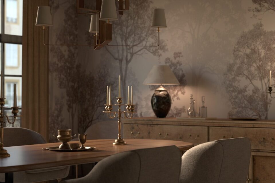
The first time a client asked me to wallpaper her dining room, my honest first thought was “why not just paint it.” That was six years ago. I’ve since wallpapered probably forty dining rooms, and I no longer ask that question — because a dining room, more than almost any other room in a house, is built for exactly what wallpaper does best: a few hours of undivided attention, at a table, under good light, with nothing else to look at but the walls.
That’s the argument for wallpaper in one sentence. Everything below is the long version what actually works, what I’d avoid, and which of the sampling apps and tools are worth your time.
Table of Contents
- Why Dining Rooms Are the Best Room for Wallpaper
- Pattern Scale: The Rule Most People Get Backwards
- Color Psychology for Dining Rooms
- Wallpaper Materials Compared
- Pattern Styles and When to Use Them
- Full Room vs Accent Wall vs the “Fifth Wall”
- Lighting and Wallpaper: An Underrated Pairing
- Pairing Wallpaper With Furniture and Trim
- Sampling Tools Compared: Physical, AR Apps, and Peel-and-Stick
- DIY Peel-and-Stick vs Professional Installation
- Mistakes I See Constantly
- Where Dining Room Wallpaper Is Headed
- FAQs
- Final Thoughts
Why Dining Rooms Are the Best Room for Wallpaper
Most rooms in a house are used in motion — you walk through a hallway, you pass through a foyer, you glance at a living room wall while doing five other things. A dining room is different. People sit still in it, often for an hour or more, usually facing the same direction, usually with the lights dimmed just enough to notice texture and shadow rather than every fine detail.
That’s precisely the environment wallpaper is designed for. A bold pattern that would feel like too much in a hallway you pass through in four seconds becomes genuinely mesmerizing when you’re looking at it over the course of a dinner. Dining rooms also tend to be lower-traffic and lower-moisture than kitchens or bathrooms, which removes two of wallpaper’s biggest practical weaknesses — grease spatter and humidity damage.
Pattern Scale: The Rule Most People Get Backwards
Most people assume small rooms need small patterns and large rooms need large patterns. In my experience it’s almost the opposite, and here’s why: a small-scale pattern repeated across a small room multiplies visually, creating a busy, closed-in feeling. A large-scale pattern in the same small room actually reads as fewer, calmer shapes, because you see less of the repeat at any given moment.
I test this constantly with clients who are nervous about “too much pattern” in a small dining nook. Nine times out of ten, going one size up from what they initially picked makes the room feel more spacious, not less. The exception is very low-ceiling rooms, where an oversized vertical pattern can genuinely overwhelm — in that specific case, a smaller or more horizontal-leaning pattern helps the eye move sideways rather than up into a ceiling that’s already close.
Color Psychology for Dining Rooms
There’s a reason so many restaurants use deep reds, warm terracottas, and rich greens rather than pale blues and cool grays: warm, saturated colors are widely associated with appetite and sociability, while cool, muted colors tend to read as calming but less stimulating — better suited to bedrooms than to a space built around eating and conversation.
This doesn’t mean your dining room has to be red. It means the warmth doesn’t have to come from the base color — it can come from the undertone. A deep forest green wallpaper with a warm gold metallic thread photographs and feels completely different from the same green with a cool silver thread, even though “green wallpaper” describes both.
My go-to palette recommendations, based on what’s actually held up well in client homes over time:
- Deep, warm neutrals (terracotta, rust, warm chocolate) for rooms with lots of natural wood furniture
- Jewel tones (emerald, sapphire, deep plum) for formal, evening-lit dining rooms
- Soft botanical greens for open-concept spaces that need to connect visually to a kitchen or living area
- Black or charcoal grounds with metallic pattern for smaller rooms that get plenty of candlelight or warm pendant lighting — this combination photographs beautifully and feels intimate rather than dark
Wallpaper Materials Compared
Not all wallpaper is created equal, and the material affects everything from cost to how forgiving it is of an imperfect wall.
| Material | Cost Range | Durability | Best For | My Verdict |
|---|---|---|---|---|
| Traditional pasted vinyl | $$ | High | Full-room installs, high-use dining rooms | The most durable option and genuinely washable, but requires a professional or a confident DIYer — pasting evenly is harder than it looks. |
| Grasscloth | $$$ | Moderate | Texture-forward, neutral schemes | Gorgeous depth and texture, but it stains easily and shows seams more than vinyl. I don’t recommend it near a table with young kids. |
| Peel-and-stick (removable) | $–$$ | Moderate | Renters, accent walls, trial runs | Genuinely improved in recent years. Newer peel-and-stick products from brands like Chasing Paper and Spoonflower hold up far better than the bubbly, curling versions from a decade ago. Not as durable long-term as pasted vinyl, but the ability to remove it without damaging walls makes it low-risk. |
| Mural/photo panels | $$$ | Moderate to high | Statement scenic walls, single feature wall | Fantastic for a single dramatic wall (a botanical scene, an abstract landscape) but not something you’d want covering an entire small room — the scale only works as a focal point. |
| Textile-backed wallpaper | $$$$ | High | Formal, high-end dining rooms | The most luxurious look and feel, but professional installation is close to mandatory, and it’s the least forgiving of an uneven wall underneath. |
If you want one general rule: choose peel-and-stick if you’re testing an idea or renting, and traditional pasted vinyl if you’re committing long-term to a heavily-used dining room.
Pattern Styles and When to Use Them
Florals. Still the most requested dining room pattern, and for good reason — florals soften a room’s formality without making it feel juvenile, especially in a muted, tonal colorway rather than a bright, high-contrast one.
Stripes. Underused in dining rooms and worth reconsidering. Vertical stripes in a subtle two-tone combination add formality and height without competing with artwork or a statement light fixture.
Geometric. Works best in modern dining rooms with simpler furniture lines. A busy geometric pattern next to an ornate, traditional table can visually fight rather than complement.
Botanical and tropical. Extremely popular over the last several years, particularly large-leaf patterns in green and gold. This is one of the few patterns I’d recommend going bold with even in a smaller room, because of the pattern-scale principle above.
Damask and traditional motifs. The classic “formal dining room” choice, and still genuinely effective in the right house — a Victorian or colonial-style home with high ceilings and existing millwork. In a more contemporary open-plan house, damask can look oddly out of place next to modern furniture.
Scenic murals. Hand-painted-style scenic wallpapers (chinoiserie-inspired landscapes, abstract watercolor scenes) have become the single most requested “wow factor” choice among my clients over the past two years. They work best on one wall only, ideally the wall guests face when seated at the table.
Full Room vs Accent Wall
The debate over whether to wallpaper all four walls or just one comes up in nearly every consultation I do, and the honest answer depends on pattern intensity, not personal preference.
A subtle, low-contrast pattern (tonal stripes, quiet botanicals) generally looks better on all four walls enough repetition to feel intentional. A high-contrast, bold pattern (large scenic murals, saturated florals, strong geometrics) usually works better contained to one wall, so the room has a clear focal point rather than visual noise from every angle.
There’s also a growing trend I’d call the “fifth wall” approach — wallpapering the ceiling rather than, or in addition to, the walls. It’s dramatic, and in a dining room specifically it works surprisingly well, because guests spend a lot of time looking slightly upward during conversation. It’s not for every room, but in a dining room with a pendant light or chandelier as a centerpiece, a papered ceiling can be the single most memorable design choice in the whole house.
Lighting and Wallpaper: An Underrated Pairing
Wallpaper sheen and metallic content interact with lighting in ways paint simply doesn’t. A wallpaper with metallic gold or copper threading will shift dramatically under warm, dimmable lighting compared to bright overhead lighting — it can look subtly shimmering at dinner and almost flat at midday.
This is worth testing before you commit, especially if your dining room is used mostly in the evening under a dimmed chandelier. A wallpaper sample that looks perfect under a store’s bright fluorescent lighting can look completely different — often better, sometimes worse — under your actual dimmed pendant at 7 p.m.
Pairing Wallpaper With Furniture and Trim
Wallpaper needs breathing room, and that mostly comes from what surrounds it. Existing wainscoting or chair rail molding is one of the best partners for a bold pattern — it gives the eye a clean stopping point and prevents the pattern from feeling like it’s taking over the entire vertical space of the wall.
Furniture matters just as much. A heavily patterned wallpaper generally wants a simpler, more solid-colored table and chairs — patterned wallpaper plus patterned upholstery plus a patterned rug is rarely a combination that reads as intentional rather than chaotic. If you love pattern-on-pattern, the safest way in is to keep the patterns in the same color family, so they read as variations on a theme rather than competing statements.
Sampling Tools Compared
I’ve tested most of the major sampling options over the years, and the differences matter more than people expect.
Physical wallpaper samples (ordered directly from brands like Cole & Son, Farrow & Ball, or York Wallcoverings). Honest verdict: still the gold standard for judging true color and texture, especially for anything with metallic or textured elements that a screen simply can’t render accurately. The downside is size — most samples are small, so pattern repeat and scale are hard to judge from one piece alone.
AR/room-visualizer apps (Photowall’s app, several retailers’ “view in your room” tools). You photograph your wall and the app overlays the pattern digitally. Honest verdict: useful for scale and general placement, unreliable for color accuracy. I’ve seen colors render noticeably more saturated on-screen than the actual printed wallpaper turns out to be. Treat these as a scale-and-composition tool, not a final color decision-maker.
Peel-and-stick sample sheets (offered by Spoonflower, Chasing Paper, and several removable-wallpaper brands). Honest verdict: genuinely the most useful middle ground. These come in a larger format than traditional samples, stick directly to your actual wall, and let you view the pattern in your real lighting for as many days as you need. This is what I now recommend to nearly every client before committing to a full order.
My actual process: narrow the shortlist with an AR app for scale, confirm true color and texture with a physical or peel-and-stick sample on the actual wall, and view it under both daytime and evening lighting before ordering.
DIY vs Professional Installation
Peel-and-stick wallpaper has genuinely closed the gap between DIY and professional results over the last several years, and for a single accent wall, most reasonably patient homeowners can get a clean result themselves in an afternoon.
Traditional pasted wallpaper is a different story. Pattern matching at seams, especially with a large-scale mural or a busy geometric, is genuinely difficult to get right without experience, and a poorly matched seam is one of the most visible mistakes in the entire room. For a full-room traditional install, I recommend hiring a professional installer unless you’ve done it before — the cost difference between a clean professional job and a DIY attempt that needs to be redone is usually smaller than people expect.
Mistakes I See Constantly
The most common one is choosing a pattern from a small sample and being surprised by how different it looks at full scale across an entire wall — this is exactly why the pattern-scale principle above matters so much before you order.
The second is ignoring the room’s actual lighting conditions until after installation, particularly with metallic or textured wallpapers that behave very differently under warm versus cool light.
The third, more avoidable mistake is pattern-matching failure at doorframes and corners — ordering without accounting for pattern repeat means you can run out of usable wallpaper faster than the math on the box suggests, especially with a large-scale mural pattern.
Where Dining Room Wallpaper Is Headed
The clearest shift I’m seeing is toward wallpaper as a single dramatic gesture rather than an all-over background — one statement wall, or increasingly, a papered ceiling, rather than wallpaper covering every surface. Scenic and mural-style patterns are driving most of this, because they work specifically as a focal point rather than a repeating background pattern.
The other shift is textural rather than purely visual — wallpapers with raised, tactile finishes (grasscloth-inspired, subtly embossed patterns) are gaining ground over flat printed patterns, particularly in warmer, more organic color palettes. I expect this to keep growing, since it pairs naturally with the broader move toward warm minimalism in furniture and lighting.
FAQs
Is wallpaper a good choice for a dining room with a lot of natural light? Yes, generally better than for a south-facing bedroom, since dining rooms are used heavily in the evening. Just be aware that direct sun exposure over years can fade certain dyes, so a north or east-facing dining room is slightly more forgiving long-term.
How much wallpaper do I need for an average dining room? This depends entirely on pattern repeat and room dimensions, and it’s genuinely worth having a supplier calculate this for you rather than estimating — under-ordering a patterned roll partway through installation is a common and frustrating problem.
Can I wallpaper over existing wallpaper? It’s possible but not recommended for a clean, long-lasting result. Removing the old layer first gives a flatter surface and avoids bubbling or seam issues down the line.
Does wallpaper make a small dining room feel smaller? Not necessarily, and often the opposite — a larger-scale pattern can make a small room feel more intentional and less cramped than an overly busy small-scale print, as covered above.
Is peel-and-stick wallpaper actually durable enough for daily use? For a moderate-traffic dining room, yes, especially the newer generation of products. It’s not as bulletproof as traditional pasted vinyl over the very long term, but it’s far more capable than the peel-and-stick products from ten years ago.
Final Thoughts
A dining room is one of the few spaces in a house built entirely around sitting still and paying attention which makes it, oddly, the best possible canvas for the boldest choice in your whole home. The pattern that feels like too much on a swatch in a bright showroom is often exactly right once it’s on the wall you’ll be looking at over dinner, in real light, for years.
About the Author
Naomi Voss is an interior surfaces and wallcovering specialist who has spent the past several years working directly with homeowners and designers on wallpaper selection, installation planning, and material sourcing. Her work focuses on how pattern scale, material choice, and lighting interact in real dining and living spaces, and she personally tests sampling tools and removable wallpaper products before recommending them to clients. She writes about wallcoverings and interior materials with an emphasis on tested, practical advice rather than fleeting trends.