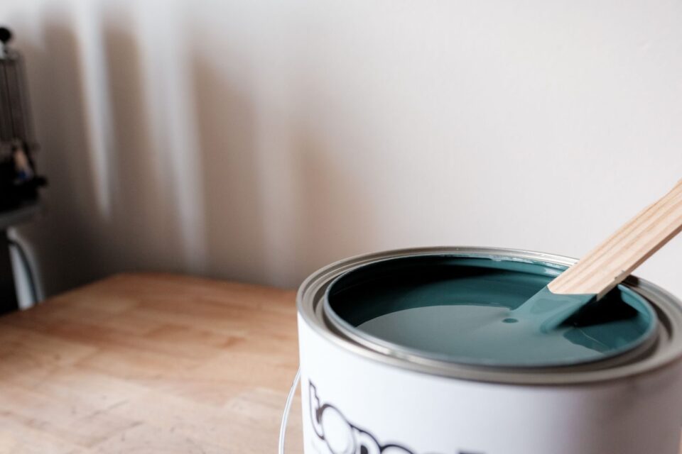
I repainted my own hallway four times before I got the teal right. Not because I’m indecisive because teal paint is one of those colors that lies to you on the chip and tells the truth on the wall. What looked like a sophisticated jewel-tone in the store turned faintly turquoise-toothpaste by 3 p.m. under my north-facing window, then looked almost navy by lamplight. That’s teal for you. It’s gorgeous, but it’s not a color you can pick casually.
This guide is everything I’ve learned from that hallway disaster, from consulting on dozens of client rooms since, and from testing sampling tools that promise to save you from my mistakes (some do, some really don’t).
Table of Contents
- Why Teal Is Suddenly Everywhere
- What Teal Actually Is (Color Theory, Simplified)
- The Undertone Trap
- Best Teal Paints by Brand — A Real Comparison
- Room-by-Room Guide
- Lighting Matters More Than the Paint Chip
- What to Pair With Teal
- Sampling Tools Compared: Physical, Peel-and-Stick, and Digital
- Finish and Sheen Guide
- Mistakes I See Constantly
- Where Teal Is Headed: Trends for 2026 and Beyond
- FAQs
- Final Thoughts
Why Teal Is Suddenly Everywhere
For a decade, gray owned every living room in America. Then greige took over. Now walk into any new build or renovation photo on a real estate listing and you’ll spot it: a teal kitchen island, a teal front door, a teal powder room that somehow makes the whole house look more expensive.
Part of this is backlash. People got tired of homes that looked like hotel lobbies — safe, forgettable, interchangeable. Teal doesn’t do forgettable. It reads as confident without tipping into the territory of “accent wall gone wrong,” which is the trap that colors like orange or magenta fall into.
The other part is practical. Teal sits at the exact midpoint between blue’s calm and green’s warmth, which means it works in more rooms than either parent color does on its own. A blue that’s too cold reads clinical. A green that’s too warm reads dated. Teal, done right, avoids both problems.
What Teal Actually Is
Here’s the thing most paint guides skip: teal isn’t one color. It’s a zone on the color wheel, sitting between blue and green, and where exactly a paint sits in that zone determines everything about how it behaves in your home.
Move a teal closer to blue and you get something like Farrow & Ball’s Vardo — punchy, a little nautical, leans cooler in daylight. Move it closer to green and you land on something like Sherwin-Williams’ Jasper, which reads almost like a dark forest color indoors and only reveals its teal identity next to true blues or true greens.
This matters because “I want a teal bedroom” isn’t specific enough information for a paint store employee to help you. You need to know which direction you’re leaning before you even look at chips.
The Undertone Trap
This is the section I wish someone had made me read before my hallway disaster.
Every teal paint has a hidden undertone — usually gray, yellow, or a touch of black — that only shows up once it’s on a large wall in real light. On the tiny chip, two teals can look nearly identical. On the wall, one might read as a sophisticated slate-teal and the other as borderline seafoam.
The way I check this now: I hold the chip up against a pure white sheet of paper and a piece of gray cardstock, in both daylight and under a warm bulb. If the teal starts looking minty or aqua next to the white paper, it has a yellow-green undertone and will likely brighten in a sunlit room. If it holds its depth and looks almost charcoal-blue next to the gray card, it has a black or navy undertone and will read moodier and more dramatic, especially in low light.
Paint stores will tell you undertones matter for grays and whites. They matter just as much — arguably more — for teal, because teal already sits between two hues. Small undertone shifts push it noticeably toward one parent color or the other.
Best Teal Paints by Brand
I’ve used all of these on actual walls, not just chips. Here’s my honest read on each.
| Brand & Color | Depth | Undertone | Best For | My Verdict |
|---|---|---|---|---|
| Sherwin-Williams Oceanside (SW 6496) | Deep | Slight gray-green | Kitchen islands, front doors | The most popular deep teal for a reason — reads sophisticated, not trendy. Goes almost black-green in shade. |
| Sherwin-Williams Watery (SW 6478) | Light | Soft, airy | Bathrooms, nurseries | Barely-there teal, closer to a pale spa blue. Gorgeous but easy to underestimate how light it goes. |
| Sherwin-Williams Jasper (SW 0032) | Very deep | Green-leaning | Moody accent walls, libraries | Practically a dark forest green until it hits blue light — then the teal shows up. Dramatic, not for the faint of heart. |
| Benjamin Moore Aegean Teal (2058-10) | Deep | True, balanced | Statement walls, cabinetry | The most genuinely “50/50 blue-green” color on this list. Reliable and less prone to shifting than most. |
| Farrow & Ball Vardo | Bold, mid-deep | Blue-leaning | Front doors, small powder rooms | Punchy and a little retro in the best way. Expensive, but the pigment quality shows — very little chalkiness. |
| Behr Blueprint | Mid-tone | Blue-gray | Living rooms, home offices | More of a blue-gray-teal hybrid than a true teal. Great if you want the idea of teal without full commitment. |
| Clare Sea You Later | Mid-deep | Warm, slightly muted | Bedrooms, rentals | A newer direct-to-consumer brand; the peel-and-stick samples are genuinely useful (more on that below), and the color itself is forgiving in mixed lighting. |
If I had to pick one for a first-time teal buyer who’s nervous about commitment, it’s Benjamin Moore’s Aegean Teal. It’s the least likely to surprise you once it’s dry.
Room-by-Room Guide
Kitchens. Teal islands have become a design signature, and for good reason — they add color without competing with countertops or backsplash tile. Go deep (Oceanside-level) if your cabinets are white or cream. A lighter teal on kitchen walls, though, can read cold under fluorescent under-cabinet lighting, so warm up your bulb temperature if you go this route.
Bathrooms. This is teal’s natural home. It echoes water without being literal about it. Powder rooms in particular can handle a bolder, deeper teal since you’re not spending hours in the room — Vardo or Jasper both work beautifully here. For a primary bathroom you use daily, a lighter, Watery-level shade tends to age better.
Bedrooms. Go softer than you think you want. A deep teal bedroom can feel wonderful in photos and oppressive by week three, especially in a room with limited natural light. Muted, grayed-down teals (Clare’s Sea You Later is a good example) tend to hold up better as an everyday color you actually sleep in.
Living rooms. This is the trickiest room for teal because you’re usually looking at the color for hours at a stretch, across changing daylight. Mid-tone teals with a gray undertone are more forgiving here than saturated jewel tones — they shift less dramatically from morning to evening.
Home offices. There’s actual research suggesting blue-green hues support focus better than warm colors, which is part of why teal has become an unofficial “productivity color” in home office design. I’ve had several clients choose a muted teal specifically for a home office wall behind their desk on video calls — it reads well on camera without looking washed out.
Exteriors and front doors. A deep teal front door is one of the highest-impact, lowest-risk color choices in exterior design right now. It reads as intentional and current without being a color that will look dated in five years the way, say, a bright coral door might.
Lighting Matters More Than the Paint Chip
I’ll say this louder than most guides do: the same exact teal will look like three different colors depending on your light bulbs and window orientation, and no chip in a store can show you that.
North-facing rooms get cool, indirect light all day, which pulls teal toward its blue side and can make it look flatter and grayer than expected. South-facing rooms get warm, direct light that pulls teal toward green and can make it glow in a way that feels almost tropical by afternoon.
Bulb temperature matters just as much. Warm bulbs (2700K, the standard “soft white”) will pull yellow into the room and mute a teal’s blue side. Cool bulbs (4000K+) will do the opposite, sharpening the blue and making the color feel more clinical. If you’re set on a specific teal, it’s worth testing your sample under your actual bulbs at home, not the store’s fluorescent lighting.
What to Pair With Teal
Teal is a strong personality color, so it needs partners that don’t compete with it.
- Whites and off-whites: Warm whites (not stark white) let teal’s depth show without harsh contrast. Avoid bright blue-white trims, which can make teal look muddy by comparison.
- Woods: Warm-toned woods like oak and walnut are teal’s best friend — the warmth in the wood balances teal’s coolness almost automatically.
- Metals: Brass and warm gold hardware add a needed counterpoint to teal’s coolness. Chrome and nickel can work but tend to make the whole palette feel colder overall.
- Contrast colors: Terracotta, blush pink, and mustard are the colors designers reach for again and again alongside teal, because they sit roughly opposite it on the color wheel and create genuine visual interest rather than clashing.
Sampling Tools Compared
This is where I’ve spent real money finding out what works.
Traditional sample pots ($5–9, most brands). You paint a small section of wall, wait a day, judge it. Honest verdict: still the most accurate method, because you’re looking at actual paint on actual drywall texture. Downside is time — you need at least a full day-night cycle to see how it shifts, and most people paint one small square and never move it to check a second wall.
Peel-and-stick large swatches (Samplize, Clare). These are pre-painted, roughly 12×12-inch sheets you stick to the wall and move around the room. Honest verdict: genuinely useful, and better than sample pots for one specific reason — size. A 12-inch swatch shows undertone shifts far more clearly than a 4-inch chip or a small painted square, and you can move it to check different walls and lighting without repainting anything. The tradeoff is that peel-and-stick sheets use a slightly different base than your actual wall paint, so texture and sheen won’t be 100% identical to the final result.
Brand visualizer apps (Sherwin-Williams ColorSnap, Behr ColorSmart, Benjamin Moore Color Portfolio). You upload a photo of your room and the app “repaints” the walls digitally. Honest verdict: fun, useful for narrowing down a shortlist, unreliable for final decisions. Every one of these apps renders color slightly differently than real paint under real light — I’ve seen the same shade look noticeably more saturated on-screen than it ever does on an actual wall. Use these to eliminate options, never to make the final call.
My actual workflow now: shortlist with an app, confirm undertone direction with a peel-and-stick swatch moved around the room for 48 hours, then buy one sample pot of the final choice and paint a section near the trim before committing to gallons.
Finish and Sheen Guide
- Matte/flat: Beautiful, velvety look for bedrooms and low-traffic walls. Shows every fingerprint and doesn’t wipe clean easily, so skip it for kitchens or hallways.
- Eggshell: The most common choice for teal walls — enough sheen to be washable, soft enough to avoid glare.
- Satin: Good for bathrooms and kids’ rooms where moisture and scrubbing matter more.
- Semi-gloss: Reserve this for trim, doors, and cabinetry rather than full walls — on a large teal wall, semi-gloss can highlight every imperfection in the drywall.
Mistakes I See Constantly
The single biggest one: choosing a teal from a phone screen or a tiny chip and skipping the large-swatch step entirely. The second: painting a small room in a deep, saturated teal and being surprised when it feels cave-like — depth that looks rich on a big open wall can feel closing-in in a five-by-seven bathroom.
The third, more subtle mistake is pairing a warm-undertone teal with cool-toned grays elsewhere in the same room. The two fight each other in a way that’s hard to name but easy to feel — the room just looks slightly “off” even though nothing is technically clashing.
Where Teal Is Headed
Based on what I’m seeing across new color launches and designer palettes for the next couple of years, teal is moving in two directions at once. On one end, muted, grayed-down teals — almost slate-teal hybrids — are showing up more in whole-house palettes, replacing the greige-everything trend with something that has more personality but still feels calm. On the other end, saturated jewel-tone teals are having a moment specifically on cabinetry and furniture rather than walls, which suggests the color is maturing from “accent wall trend” into a genuine, lasting neutral-adjacent choice for permanent fixtures.
I’d bet on the muted, slate-teal direction having the longer shelf life. Bold jewel tones cycle in and out of fashion faster than more restrained versions of the same hue.
FAQs
Does teal make a small room feel smaller? A deep, saturated teal can, especially in a room with little natural light. A lighter or more muted teal, on the other hand, can actually make a small room feel more distinct and intentional rather than cramped.
What’s the difference between teal and turquoise paint? Turquoise leans further toward green and is typically brighter and more saturated. Teal sits more centrally between blue and green and is usually deeper and more muted — think jewel tone versus tropical-pool color.
Is teal a timeless color or a passing trend? Muted, grayed-down teals have staying power similar to navy or forest green. Bright, highly saturated teals are more trend-driven and more likely to feel dated in five to ten years.
Can I use teal in a room with warm wood floors? Yes, and it often looks better than teal with cool-toned floors. Warm wood balances teal’s coolness, which is part of why teal kitchens with oak or walnut floors photograph so well.
Should I test teal paint at different times of day? Yes — this is non-negotiable if you want an accurate result. Morning, midday, and evening light will all show you a slightly different version of the same paint.
Final Thoughts
Teal rewards patience and punishes shortcuts. It’s not a color you can safely pick from a swatch book in a fluorescent-lit aisle and trust completely it needs to earn its place on your wall by surviving your actual lighting, your actual floors, and your actual daily life in that room. But when it works, and it usually does once you’ve done the legwork, teal gives a home a kind of quiet confidence that beige, gray, and white simply can’t offer. My hallway, four coats later, finally got there. Yours will too, just hopefully in fewer attempts than mine.
About the Author
Elena Marsh is a color consultant and interior materials researcher who has spent the past decade helping homeowners and small design studios navigate paint selection, lighting analysis, and finish specification. Her work focuses on how pigment, undertone, and ambient light interact in real residential spaces, and she regularly tests paint brands and sampling tools firsthand before recommending them to clients. She writes about color theory and home design with an emphasis on practical, tested advice over trend-chasing.