


For years, white marble ran the show. Carrara, Calacatta, Statuario these pale, veined stones became so synonymous with “luxury kitchen” that entire industries grew up around quartz engineered specifically to imitate them. The look was beautiful, certainly. But after a decade, it also became predictable in a way that’s hard to ignore. You’d see the same slab on a design blog, on a magazine cover, on a neighbor’s renovation Instagram, and in a spec builder’s showroom, all within the same week. What’s happening in kitchens right now and accelerating sharply through 2025 and into 2026 is something genuinely different.
The marble that’s moving designers and homeowners is no longer the palest option in the quarry. It’s the green with veining so dark it looks like a topographic map. This is the burgundy with deep red swirls that reads differently in morning light than it does at dinner. It’s the dramatic black slab that reflects the pendant above it like still water. Rich-colored marble has arrived as a serious design force, and the reasons go much deeper than aesthetic fashion.
Why the Shift to Color Is Happening Now
The timing of this trend isn’t accidental. After the sterile, all-white, all-grey kitchens that dominated the 2010s, there’s been a visible and sincere appetite for spaces that feel warmer, more personal, and harder to replicate. People spent years optimizing their homes for real estate photography rather than real life, and there’s been a collective course correction.
Rich-colored marble speaks directly to that correction. Each slab is genuinely unique — the veining pattern, the depth of saturation, the way minerals cluster in one corner and dissipate in another. Two kitchens with the same variety of green marble will never look identical. That irreproducibility is something no engineered surface can offer, and it’s exactly what people are paying for right now.
There’s also an alignment with the broader 2026 color direction. Benjamin Moore’s Color of the Year for 2026, “Silhouette,” is a sophisticated blend of burnt umber, charcoal, and warmth — a signal that depth and grounding are the palette of the moment. Sherwin-Williams’ Colormix Anthology for 2026 includes what it calls “Restorative Darks” — deep auburns, plum-browns, and rich forest tones. These palettes work in extraordinary harmony with the natural hues found in colored marble. The design world is, in effect, building an environment in which rich-colored marble kitchens look at home rather than jarring.
The Stones Leading the Movement
Green Marble: Nature’s Most Sophisticated Kitchen Material
No stone is generating more conversation in kitchen design right now than green marble, and on closer look, the reasons are obvious. Deep forest greens, emerald slabs with bold white veining, moss-toned stones with quieter, more scattered patterning — they all manage something that few materials accomplish: they bring the visual quality of the natural world into a highly functional, often industrial-feeling space without looking rustic or themed.
Verde Guatemala, Verde Alpi, and Cipollino are among the varieties leading the charge. Each has a distinct character — Verde Guatemala has bold, almost geometric patterning in white and black against a deep green ground; Verde Alpi reads softer, with undulating grey veins against olive tones; Cipollino has a directional, layered quality that resembles folded silk. The point isn’t to choose a favorite — it’s to understand that “green marble” spans a wider range of visual personalities than most people initially assume.
In the kitchen specifically, green marble performs beautifully as an island countertop, becoming the undisputed focal point of the room without competing visually with the cabinetry. Paired with natural walnut or dark oak joinery, it creates the kind of warm sophistication that photographs impossibly well but also — critically — looks even better in person. With brass hardware and unlacquered fixtures that develop patina over time, the combination deepens in quality as the kitchen ages.
A practical note: green marble is still marble, meaning it’s porous and requires regular sealing. But the forgiving quality of dark stone is worth mentioning — minor etching, the small evidence of daily life, reads as much less catastrophic on a deep green surface than it would on white Carrara.
Burgundy and Red-Toned Marble: The Bold Choice That Ages Beautifully
Burgundy marble was largely consigned to hotel lobbies and period-revival interiors for years. What’s changed is context — specifically, the willingness of contemporary designers to pair it with modern elements in ways that strip away the heaviness it traditionally carried.
Rosso Levanto is the variety generating the most attention: a deep, wine-red ground with dramatic white veining that moves across the surface like lightning. It’s not a subtle stone, and it doesn’t pretend to be. In a kitchen with matte white cabinets, concrete floors, and minimal hardware, a Rosso Levanto island or countertop reads as genuinely arresting — the kind of design decision that makes people stop and actually look at a space.
Deeper red tones like Rosso Verona or the richly patterned Breccia Rosé carry similar energy with slightly more earthiness. These are stones that reward honed finishes over polished ones — honing a red marble moderates its intensity. It adds a touchable, matte quality that sits better in residential spaces than the fully reflective polish, which reads more commercial.
The key pairing consideration with burgundy marble: keep everything else restrained. Off-white, warm cream, natural wood, and aged or matte metal finishes allow the stone to anchor the space without competition. When equally assertive materials surround burgundy marble, the result is chaos. When it’s given space, it’s extraordinary.
Black and Charcoal Marble: Drama That Holds Its Composure
Black marble has always carried prestige — Nero Marquina from the Basque Country in Spain is one of the most recognized luxury stones in the world — but its role in kitchens has historically been supporting rather than starring. That’s shifting. Nero Marquina, used as a full-island surface or a floor-to-ceiling slab backsplash, is now a primary design statement, not an accent.
The visual logic is compelling. Black marble with white veining creates a natural inverse of the classic white-with-grey-veins formula. The same geological drama, the same sense of looking at geological time compressed into a surface, but in a register that’s cooler, more authoritative, and more interesting in spaces with warm artificial lighting.
Emperador Dark, a deep brown-black marble quarried in Spain, offers a slightly warmer take. Its veining tends toward gold, caramel, and tan, creating a surface that reads as dramatic without feeling cold — particularly relevant in kitchens where the goal is gathering and warmth rather than gallery-like reserve.
Blue and Viola Marble: The Unexpected Contenders
If green marble is the dominant trend and burgundy is the bold choice, then blue and violet-toned marble is where the most interesting conversation in design is currently happening.
Azul Macaubas, a quartzite that reads visually like blue marble, has been gaining considerable traction — though it’s technically quartzite rather than marble, its aesthetic belongs in this conversation. Viola Persichino, a genuine marble with lavender and violet tones, is being used by designers who want color without the obvious warmth of green or the intensity of red.
These cooler-toned stones pair particularly well with the pale lavender, celery, and frosted tints that form one branch of Sherwin-Williams’ 2026 color palette. A violet-veined marble island against pale sage cabinetry and aged brass hardware is the kind of combination that feels genuinely fresh rather than fashionably derivative.
Application Beyond the Countertop: Where Rich Marble Belongs
The countertop remains the primary application for marble in kitchens, but the trend most worth noting in 2025 and 2026 is the expansion of marble’s role into surfaces that weren’t previously standard.
Full-Height Slab Backsplashes
Carrying a countertop marble slab vertically up the wall — sometimes all the way to the ceiling in cooking areas — creates a continuity that turns a functional surface into architectural intention. The veining travels upward, the visual boundary between work surface and wall disappears, and the kitchen reads as a composed, singular space rather than an assembly of separate elements. This application works best with stones that have strong directional veining, because the movement from horizontal to vertical is only convincing when the veining has a clear flow to follow.
Waterfall Islands
The waterfall island — where the countertop material folds down over the sides of the island, extending to the floor in a continuous vertical panel — remains one of the most effective ways to maximize the visual impact of a beautiful stone. With rich-colored marble, the effect is especially powerful. The veining wraps around the corner of the island, creating a dynamic, three-dimensional pattern that rewards a walk around. Bookmatched waterfall edges, where two mirror-image slabs are joined at the vertical edge, produce a symmetrical butterfly-wing effect that has become one of the most coveted details in high-end kitchen design.
Feature Walls and Kitchen Surround Panels
Beyond the immediate cooking zone, rich marble is increasingly appearing on kitchen walls not directly adjacent to the countertop — a panel framing a range hood, a section of wall between windows, or a full wall treatment behind open shelving. These applications use marble more like a textile or wall covering than as a functional surface, and the results can be stunning. The key is choosing a stone with enough visual presence to carry a large, uninterrupted plane without the surface looking busy or overwhelming.
Pairing Rich-Colored Marble kitchen With the Right Design Elements
The most common design mistake with rich-colored marble kitchens is trying too hard to balance the stone. The understandable instinct is to use multiple competing elements to “ground” the dramatic stone. The result is usually a kitchen where nothing reads clearly, and the marble, paradoxically, gets lost.
The better approach is disciplined restraint around the stone.
Cabinetry: In most cases, a rich-colored marble kitchen benefits from cabinetry that recedes rather than competes. Matte white, warm cream, putty grey, and natural wood are the most reliable choices. Dark cabinetry paired with dark marble requires very precise tonal calibration to avoid a kitchen that reads as uniformly dim.
Hardware: Unlacquered brass and aged bronze are the strongest hardware pairings for warm-toned marbles — burgundy, green, and gold-veined varieties. Matte black hardware works well with cooler-toned stones — blue, violet, and grey marbles. Polished nickel and chrome tend to flatten against rich marble surfaces; their brightness competes with the stone rather than supporting it.
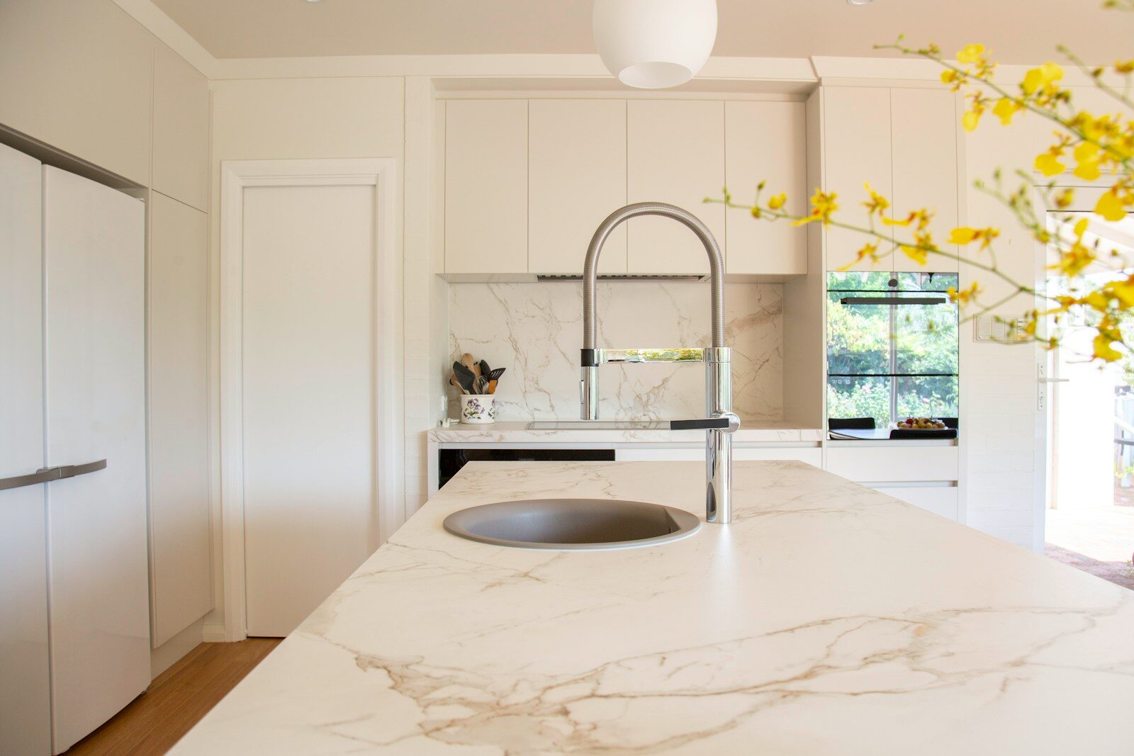
Flooring: The floor is where many rich-colored marble kitchens either come together or fall apart. Light, warm wood floors — European white oak, lightly oiled and unsealed — create a beautiful ground beneath dark or richly toned marble without pulling focus. Large-format stone tiles in neutral or complementary tones also work well. Pattern-heavy floors are generally a mistake: the marble and the floor end up in conversation with each other rather than with the person using the kitchen.
Lighting: Warm, directional lighting — pendants with amber glass, recessed fixtures with a warm color temperature (2700K–3000K), under-cabinet LED strips — activates rich marble in ways that cool, white light cannot. The minerals in colored marble absorb and reflect warm light differently than cool light, revealing depth and variation that fluorescent or daylight-temperature fixtures don’t show.
The Honest Maintenance Conversation
Choosing rich-colored marble for a kitchen is a genuine commitment, and it’s worth understanding what that entails before falling in love with a slab in the showroom.
Marble is porous. It will absorb liquids if unsealed or if the seal has degraded, and acidic substances — wine, lemon juice, tomato, vinegar, fizzy drinks — can etch the surface, leaving dull spots where the calcium carbonate in the stone has reacted chemically with the acid. These marks are not stains; they’re surface damage, and they can’t be cleaned away. They can be honed or polished out by a stone professional, but prevention is significantly more practical than repair.
The good news is that richly colored marble is more forgiving than white marble. On a deep green, burgundy, or black surface, minor etching is far less visible than it would be on white Carrara. The surface develops what stone specialists call a patina — a subtle accumulation of micro-variations that, in darker stones, reads as character rather than damage.
Sealing is essential and should be scheduled. For kitchen countertops in regular use, resealing every six to twelve months is the standard recommendation. A simple test: pour a small amount of water on the surface and wait ten to fifteen minutes. If the water beads up and rolls off, the seal is intact. If the water darkens the stone or leaves a wet spot after drying, it’s time to reseal. Use a penetrating (impregnating) sealer rather than a topical one — impregnating sealers work within the stone rather than forming a film on top, which can yellow and peel over time.
For daily cleaning, a pH-neutral cleaner and a soft cloth are all that’s needed. Avoid anything acidic, including most commercial multi-surface sprays, and avoid abrasive pads that can scratch polished surfaces.
Cost and What to Expect
Rich-colored marble varies significantly in price depending on origin, rarity, and the complexity of the application. Basic marble slabs suitable for kitchen countertops can start at $75 to $150 per square foot installed. Premium colored varieties — deep greens, rare burgundies, bookmatched applications — can run $150 to $500 per square foot or more, depending on the stone and the fabricator.
Waterfall islands and full-height slab backsplashes add material and labor costs because they require more precise matching and larger slab quantities.
These are not small investments. But they are also among the most durable surface investments a kitchen can receive — properly maintained marble lasts decades and generally adds measurable resale value to homes in markets where buyers understand what they’re looking at.
FAQs
Is rich-colored marble suitable for a busy, high-use kitchen?
It can be, with honest expectations about maintenance. A kitchen where red wine sits on the countertop while someone finishes dinner is a different story. If you cook heavily and can’t commit to consistent maintenance, consider using rich-colored marble for lower-stress applications — an island only, or a backsplash rather than a full countertop — and pairing it with quartzite or engineered surfaces in higher-risk zones.
What’s the difference between a honed and a polished finish for rich marble?
Polished finishes are reflective and bring out the full depth and saturation of the stone’s color, making veining more pronounced. They show fingerprints, watermarks, and etchings more readily. Honed finishes are matte, offer a softer, more tactile quality, and are generally more forgiving of daily use on dark and rich-toned stones. Most designers working with richly colored marble in residential kitchens favor honed or leathered finishes for countertops and polished finishes for backsplashes and vertical applications.
Can rich-colored marble be used in a small kitchen without overwhelming the space?
Yes, but application choice matters. A single-slab countertop in a small kitchen with white cabinetry makes a bold statement without enclosing the space. Full marble wall applications in small kitchens require very careful lighting to avoid a heavy, tunnel-like effect. The scale of the stone’s veining also matters — finer, more distributed veining reads less assertive at close range than large, dramatic veining patterns.
How do I match hardware to green marble?
Unlacquered brass is the single most reliable pairing for green marble in almost all shades. The warm gold tones of brass against the cool mineral green create a combination that feels natural rather than designed — like something you’d find in a very well-traveled, very well-lived-in house. Aged bronze works similarly. Matte black can work with darker greens, but tends to compete with the green rather than complement it.
Looking Forward: Where Rich-Colored Marble Kitchen Are Heading
The direction for the next two to three years is toward even greater specificity of stone choice — away from “green marble kitchen” as a category and toward the particular variety, quarry region, and finish combination as a design decision in itself. Designers who know the difference between Verde Guatemala and Verde Alpi will design different kitchens with each, and that level of material literacy is increasingly accessible to informed homeowners.
The other development worth watching is the expansion of marble beyond its traditional kitchen footprint. Integrated marble sinks, marble-clad range hoods, and marble shelving within open kitchen storage are all gaining traction as ways to extend the material’s presence without the cost of full countertop coverage.
You can engineer a surface to look like white Calacatta. You cannot engineer the depth of a genuine Verde Guatemala island in morning light. That irreplicability is the deepest asset these materials possess, and it’s what makes them a sound design investment rather than a trend.
A Final Thought
There’s a version of the rich-colored marble kitchen that lives only in mood boards and renovation budgets that never quite get approved.
And there’s a version that gets built — that has a green island installed on a Thursday morning, that looks slightly different by Saturday when the first dinner party happens under warm candlelight, that develops small evidence of life over the years and becomes more interesting for it.
It asks for reasonable attention and gives back genuine beauty the kind that gets richer, not duller, as time passes.
That’s not a trend. That’s the right reason to choose a material.